
Relaxing Color Palettes for Coloring
When you sit down to color, it is not just the picture that shapes how you feel. The colors you choose – and how they work together – can make the page feel either soothing or slightly agitating, even if you cannot quite say why.
Research on color psychology suggests that different hues and combinations can influence mood, attention and perceived stress levels, although effects vary between individuals and cultures. Cool tones such as blues and greens are often linked with calm and balance, while very bright, highly saturated colors are more stimulating.
For adult coloring used as a calming ritual, that gives you a useful lever: instead of grabbing random colors, you can build soft, deliberate palettes – like gentle greens and muted golds – that support the kind of mood you want.
What color psychology tells us about calming hues
Color psychology looks at how color can shape mood and behaviour. Overviews note that, although there is no universal rule for everyone, some patterns do appear consistently:
- Blue is frequently associated with calm, stability and relaxation, and is often used in environments designed to feel soothing or trustworthy.
- Green is strongly tied to nature, renewal and balance, and is often described as a restful color for the eyes that can promote feelings of peace.
- Muted warm tones (soft yellows, golds, terracotta) are used in interior design to create comfort and intimacy rather than high-energy stimulation.
Reviews in environmental and interior psychology point out that not only individual colors but also color harmony – how hues sit together – affects how pleasing and relaxing a space feels. Neighbouring hues and balanced palettes are more likely to be experienced as “visually right” and reassuring.
Working theory: when you choose soft, harmonious palettes for your coloring pages, you are borrowing the same principles designers use to make real rooms feel calm.
Why soft greens and gentle golds work so well
“Soft greens” and “gentle golds” are not exact technical terms, but they share three important qualities:
- Lower saturation – colors are more muted than neon or primary tones.
- Mid–light value – not too dark and heavy, not glaringly bright.
- Natural associations – leaves, moss, evening sunlight, candlelight, wood.
Interior design guidance on color and wellbeing notes that:
- cool greens and blue-greens tend to bring serenity and balance
- warm, muted golds and caramels create warmth and comfort
- pastels and softened tones are especially suitable where you want spaces to feel tranquil
Applied to coloring, that translates into palettes that feel quiet, grounded and slightly nostalgic – exactly what many people want from a calming coloring session.
Practical relaxing palettes you can try
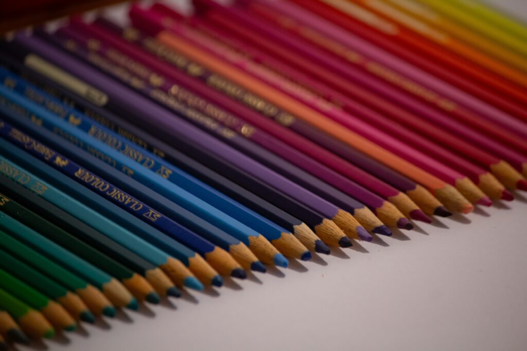
You do not need to match any exact swatch. The goal is coherent, softer combinations. A few starting points:
1. Forest & linen
Good for: nature scenes, wreaths, trees, quiet background elements.
- 2–3 greens: sage, moss, deep pine
- 1 neutral: warm grey or soft beige
- 1 accent: muted berry red or plum, used sparingly
This leans on nature associations and keeps the accent color small so it does not overpower the page.
2. Gentle golds & soft browns
Good for: candles, fairy lights, baubles, architectural details.
- 2 yellows: soft straw and muted gold/ochre
- 1 brown: light chestnut or caramel
- 1 neutral: warm off-white or very light grey
This palette picks up the warmth of lamplight and wood rather than harsh, bright yellow.
3. Blue-green calm
Good for: backgrounds, skies, water, clothing, abstract patterns.
- 2 blue-greens: seafoam, deep teal (kept slightly muted)
- 1 blue: soft denim or slate blue
- 1 neutral: cool grey
Color psychology resources repeatedly highlight blue as calming and trustworthy; pairing it with softened green tones keeps the mood balanced rather than cold.
4. Misty pastels
Good for: mandalas, repeating patterns, anything you want to feel light.
- 3–4 very light tones: dusty rose, lavender-grey, pale sage, powder blue
- optional soft neutral: light taupe
Design articles on color and wellbeing note that pastel tones are especially effective when you want a space (or, here, a page) to feel comforting and serene.
How to use palettes to support a calming routine
Color choices are only one part of how relaxing a session feels, but they can reinforce other calming practices.
- Limit your palette before you start
Pick 4–6 pencils and put the rest away. This reduces decision fatigue and supports a feeling of coherence as the page develops. - Pair color with breathing
NHS and other health services list simple breathing exercises as core tools for reducing stress and anxiety.- For example, each time you switch to a new color, take one slower, deeper breath before you start shading.
- Use calmer colors for larger areas
Reserve the soft greens, blues and neutrals for big background sections. If you want brighter accents (for ribbons or tiny details), keep them small so they do not dominate the overall impression. - Notice your reactions
As you color, pay attention to how different combinations feel. If a particular hue feels jarring, there is no rule that says you must keep using it. Over time, you will build a personal library of “calm colors” that work for you. - Avoid overstimulation palettes when you want to unwind
Recent coverage of color and stress in interiors warns that very bright, high-saturation combinations (neon tones, strong complementary opposites used in large blocks) can be visually tiring and heighten stress in some people.
That does not mean you can never use bold colors – only that they are better for energetic, playful pages than for late-night wind-down sessions.
A small experiment: same page, different palette
One simple way to see the effect of palette on mood:
- Choose a single design you like.
- Print or copy it twice.
- Color one version in soft greens and gentle golds with neutrals.
- Color the other in high-saturation reds, bright yellows and intense contrast.
Then compare:
- How you felt while coluring each version.
- How your body feels when you look at each page afterwards.
This informal experiment should make it easier to trust your own responses rather than abstract rules.
Further reading on color and mood
For accessible, evidence-informed overviews:
- Color Psychology: How Colors Affect You – broad introduction to color psychology and how colors can influence mood, attention and behaviour.
- Color: its influence and impact on the way we live – University of Leeds – discusses research on color combinations, harmony and how colou affects the way we experience environments.
- The Power of Color – Knight Frank Interiors – applied look at how warm, cool and neutral palettes are used in interior design to evoke calm, comfort or energy.
Coloring for calm does not require you to follow strict rules, but understanding how softer greens, gentle golds and balanced palettes tend to affect mood gives you an extra tool. With a small, carefully chosen set of colours, your pages can become not just pretty, but genuinely restful to make and look at.